Billboard (WIP)
An identity redesign of Billboard that focuses on reflecting their reputation as a leader in charting music popularity while conveying the heat of competition in the music industry.
Process
This project is currently in the being developed—more to come soon.
Montage
Logo

The new logo sports a bold and angular look that speaks to the competitive spirit of billboard, while the elongated stems of the "b" and "d" letterforms reflect the movement and growth of the music charts.


It was created on a grid derived from a bar of sheet music that dictate the proportions of the form by aligning the counters to a playable music note.
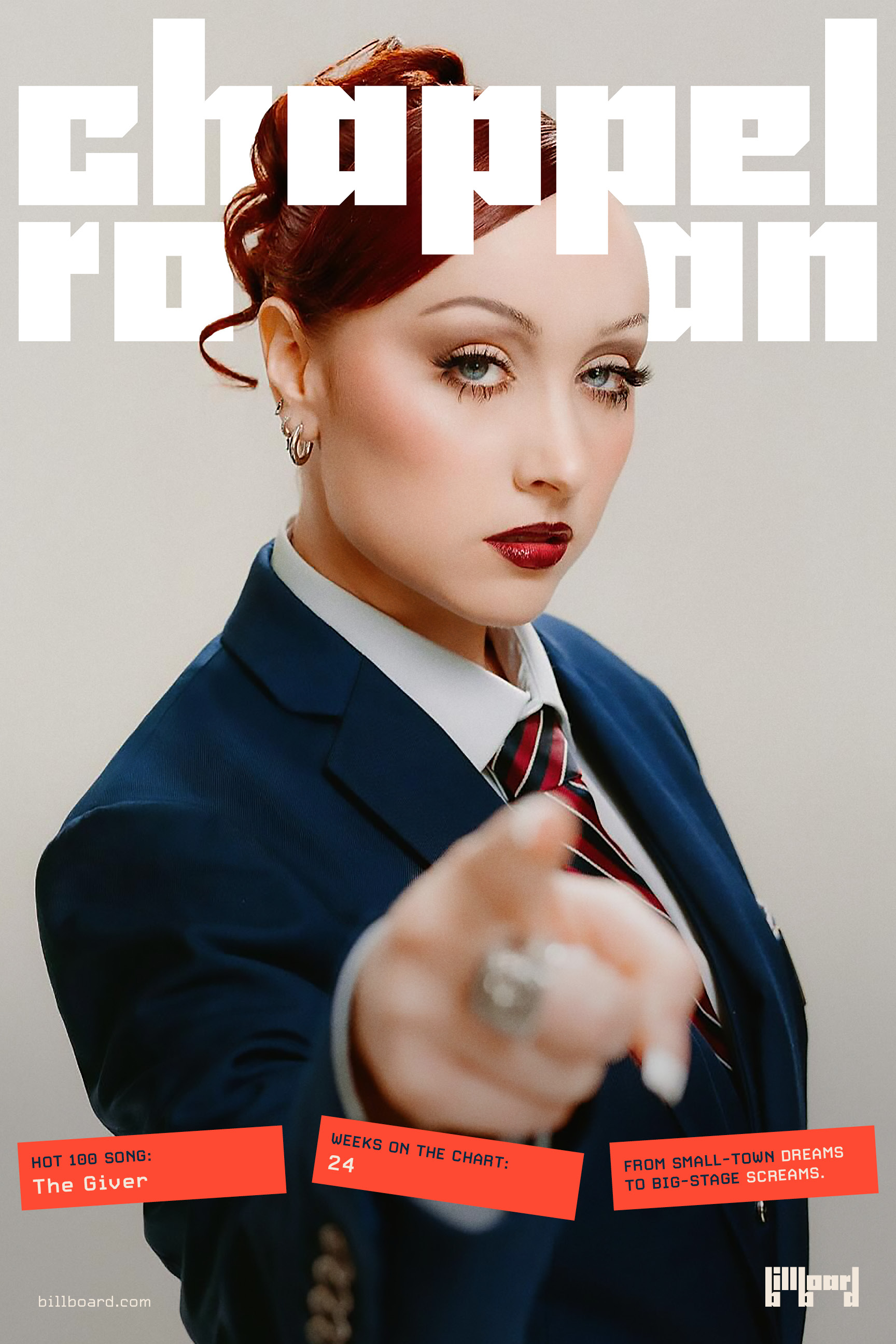
Posters


The graphic system uses overlapping squares and rectangles to mimic the act of billposting or the pasting of advertisements which connect to the history of billboard, but also imbues the identity with a sense of quick and ever-changing dynamism.
Custom Font

Charted is a custom lowercase font that was created based off the custom logotype to be used as a unique, bold display typeface.
Process
